The perfect vignette: creating visual harmony in styling
it's all in the moment“I love the process of turning simple, everyday objects into design moments.
Vignettes are like the punctuation in your home’s design narrative – those little accents that pull everything together.”
Well, here we are again. Another blog post about crafting vignettes, and you probably still wondering WTF a vignette is.
I wrote about the art of the vignette in interior design and styling in an earlier blog post, but if you’ve only just joined us – a vignette is essentially a grouping or cluster of objects within a space.
They are like the punctuation in your home’s design narrative – those little accents that pull everything together.
Whether it’s atop a console table, on a bookshelf, or a statement corner, vignettes breathe life and personality into spaces.
But how do you create a vignette that doesn’t just look pretty but also feels harmonious and intentional? Let’s break it down.
Step 1Follow the rule of thirds
If you’ve ever dabbled in photography or design, you’ve likely heard of the rule of thirds. This principle applies well when crafting vignettes as well.
Imagine a 3x3 grid over your vignette space. You want to position your items so that the focal points land along those grid lines, drawing the eye naturally.
Start with your anchor piece – this could be a framed artwork, a tall vase, or a statement lamp. Place it off-centre rather than directly in the middle. This creates movement and a more dynamic composition.
Then, layer smaller items to the sides. Think of it as arranging a little ecosystem where every element complements the next.
Step 2Play with height and scale
When it comes to visual harmony, variation is key. When your vignette has items of different heights, it adds dimension and depth, and adds visual interest.
You could try pairing a tall vase with a medium-height candleholder and a low bowl or stack of books. This contrast draws the eye in and makes the arrangement feel more engaging.
Pro Tip: Use objects that naturally vary in scale, like combining a large piece of art with a smaller stack of decor. A small sculpture next to a towering plant can make a space POP without being overwhelming.
This helps to create a visual ‘triangle’, which adds to the sense of visual harmony.
Step 3Embrace texture
If there’s one thing I’m a sucker for, it’s texture. Boucle, travertine, wood grain; you name it, I want it.
In a vignette, it brings an element of surprise and warmth as well as adding to that all-important visual interest.
Think about mixing smooth surfaces like glass or metal with rougher, more organic materials like wood, stone, or woven textiles.
A ceramic vase next to a wicker basket or a glossy photo frame paired with a weathered wooden candleholder can make your vignette visually rich and more tactile.
Vintage pieces are also a great way of adding texture and character to your vignette, through worn and weathered patina.
Step 4Stick to a colour palette
As with grouping pieces in any aspect of a space, it’s important to have at least a broad colour scheme in play.
When selecting items for your vignette, pick pieces that either complement or contrast with your existing room’s colour scheme.
If your room is neutral, including a pop of colour in your vignette can create an exciting focal point. On the flip side, if your room is already vibrant, grounding your vignette in more muted tones can offer balance.
This extends to the vignette itself. You’re grouping objects together in a way where they will sit within close proximity to each other – so it’s important to ensure they work harmoniously together.
Using two or three colours in different shades or finishes helps create visual unity. For instance, pairing matte black accessories with brass or gold accents gives an elegant, modern feel.
Step 5Add a touch of nature
If you’ve seen any of the vignettes I’ve shared from within our home, you’ll know that this is a big one for me.
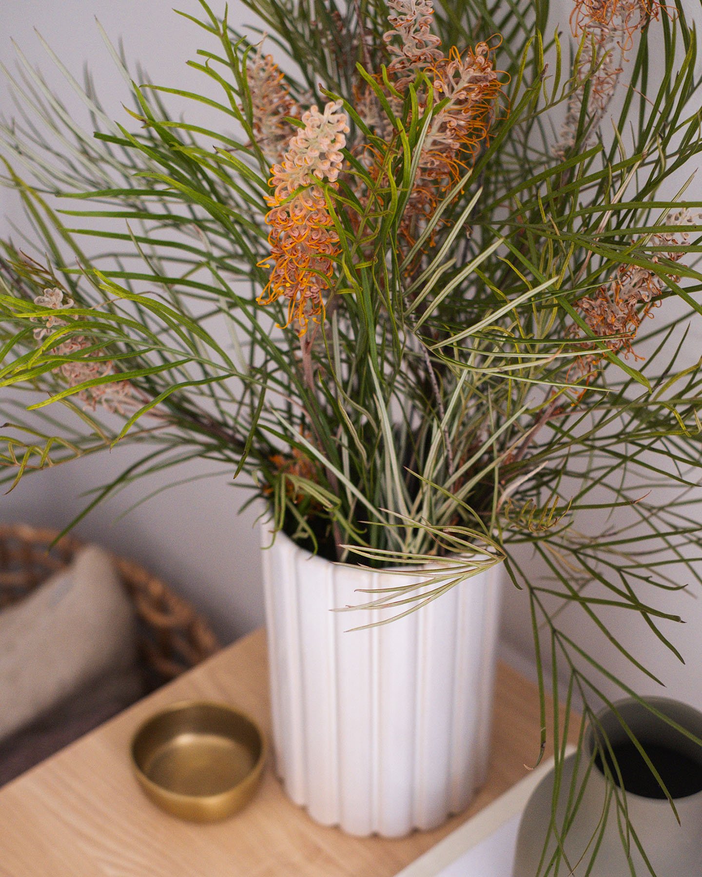
I don’t think there is a single vignette in our home that doesn’t include a vase of foliage, or natural element of some kind.
Whether it’s a lush green plant, a sprig of fresh foliage from the garden in a vase, or even a bowl of fresh fruit, natural elements infuse vitality into your design.
The organic shapes of plants and flowers also break up the more structured lines of your other decor items, providing a beautiful contrast. Even a pinecone can do the trick!
Step 6Curate with meaning
While it’s easy to fill your vignette with trendy decor items, I like to think the most impactful spaces are those that reflect your personal story.
Incorporate pieces that hold sentimental value – whether it’s a family heirloom, a souvenir from travels, or your favourite vintage find from a thrift store. These elements bring warmth and authenticity, making the vignette not only stylish but also deeply personal and made to last.
Creating the perfect vignette is an art that balances form and function. It’s about layering height, texture, and colour while telling a visual story.
In my books, the best vignettes feel cohesive, yet have a sense of spontaneity – as though they just came together naturally.
I love the process of turning simple, everyday objects into design moments. It’s a great way to share your personality and story within your home.
Remember, the best vignettes are fluid – don’t be afraid to switch things up, rotate items in and out, and refresh your space as the seasons change (especially at Christmas!). After all, your home is your canvas.
You won’t escape these design moments in my home, and I hope it feels the same for you in your home too.


Discover my favourite classic patterns that are sure to be a hit however you use them.